Biontech Pitch
When I volunteered to work on the pitch for BionTech, I had no idea of what a pitch presentation looks like. My team and I broke down a large, abstract problem into an actionable one, and managed to provide three unique solutions all within a week!
Challenge / Competitor Research / Understanding the user / Process / Solution / Presentation / Outcome
The challenge
BioNTech, renowned for its innovative mRNA technology, is set to launch its first oncology products in the US by 2026. To ensure a successful market entry, a well-crafted digital experience is critical.
This UX case study outlines the research ( current web presence) , analysis, and design process used to enhance BioNTech’s the web presence to support a successful oncology market launch focusing on key stakeholders such as healthcare professionals (HCPs) and patients.
Note from client: Do not focus on the content provided but explain how you would make BioNTechʼs web landscape (incl. gated content) more attractive to its target audience from a customer experience perspective.
Competitor Research
A competitor research was the starting point, to uncover best-in-class practices, common trends, and recurring design patterns within the oncology and healthcare digital landscape.
This step provided valuable insights into what engages users effectively, how competitors structure their content, and which interactive features resonate most.
The goal was to identify patterns that addressed a few main points:
1) Strategy - how do get there (oncolcogy/cancer section)
2) what are the checkmarks making a page good in oncology?
3) Best ux/usability but also right information for the target group
An interesting discovery was that a single pharmacology brand website can serve multiple primary audiences (patients, HCPs, KOLs) with varying needs.
Since BioNTech will be a new player in a highly competitive and mature Oncology market, it is crucial for them to provide ALL stakeholders – investors, healthcare professionals, medical opinion leaders, potential employees, patients, care-givers and legislators – with an excellent first-hand experience with their communication channels and offer an engaging way for them to find the information they are looking for.
Understanding the user
From the competitor research it was apparent that were many potential target audiences however for the scope of the pitch we chose to focus on patients, HCPs, and KOLs. They have varying needs, however are at the heart of all medical and pharmacological resources. (Audience needs defined in slide 6 below)
Process
Step 1 - Taking stock of the status quo
To reimagine BioNTech's web presence, we started by diving deep into its existing sitemap and information architecture (IA). This analysis helped us uncover structural gaps, assess content flow, and pinpoint areas where the user journey could be optimized.
By understanding how users currently navigate and where they encounter friction, we identified key opportunities to create a more intuitive, stakeholder-focused experience that seamlessly delivers the right information to the right audience.
Observations:
At first glance menu appears well-laid, but there’s a lot of cross-linking and related content isn’t grouped together.
Redundant and repetitive menu items
Lacks tailored user experiences for different segments
There appears to be no font or CTA hierarchy, making it unclear what content is important
Unclear which audience the website speaks to since the TOV
Overhwhelming contact options, spread out in an inaccessible way
Key Factors for Assessment:
How easily can users find information (clinical data, product pipeline, trial information, investor reports, etc.)?
Is the structure tailored to different audience needs, or is it one-size-fits-all?
Is the design simple and modern, or is it cluttered and difficult to navigate?
Is the site optimized for different devices (mobile, tablet, desktop)?
Does the site personalize content based on user type (e.g., HCPs, patients, investors)?
Does it offer interactive tools, such as clinical trial finders, product pipelines, or investor dashboards?
Are there features like chatbots, live chat, or FAQ sections for immediate user queries?
Is gated content effectively used to engage stakeholders while providing premium or exclusive content?
Anatomy of the Oncology pages (This diagram is for illustrative purposes)
Step 2 - Brainstorming the solution
The mind map below, along with the concept stickies on the right, emerged from a dynamic and collaborative brainstorming session. All ideas from the mind-map were validated against the current website, the industry standards, the .. to generate concepts that could be provided as solutions.
The Broad Phase (Top of the Funnel)
The Narrow Phase (Bottom of the Funnel)
The Solution
We scrapped the concept to improve the current IA and sitemap structure as it wasn’t possible to present a proposal for the same in the short time frame we had to present the ideas in the pitch. The concepts we chose to go with were:
Concept 1
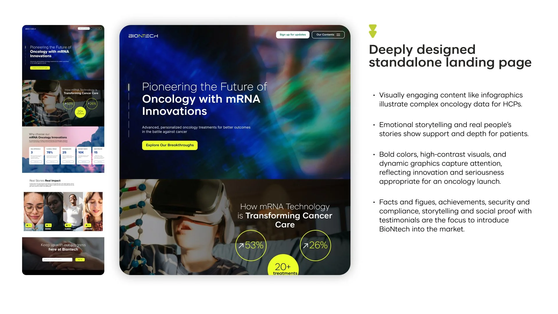
A single landing page that caters to HCPs + KOLs + patients
Concept 2
Two separate landing pages, one for HCPs + KOLs, and another for patients
The Presentation
Due to the severe pressure of time, the working files so far had been quick and dirty.
While the concepts were now clear, the challenge was tell a story that would resonate the decision-making stakeholders at BioNTech, while simultaneously showcasing our expertise as a UX Design team.
We chose a classic hero's journey arc, enriched with emotional depth and a human-centered focus
Lastly, the presentation had to be visually compelling, as the first round of the pitch process required submitting PDFs only, with in-person Q&A reserved for shortlisted candidates in the second round.
And finally, for that ‘wow’ factor, there was a surprise easter egg into the presentation!


